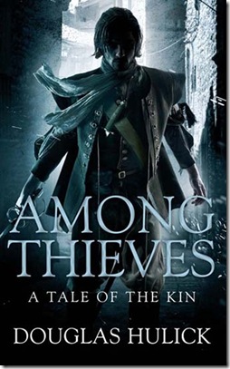
Sometimes, I wonder what publishing companies are thinking. I was checking out a blog I read often – Blood of the Muse – and came across Among Thieves: A Tale of the Kin. The UK cover art is amazing – the sort of thing I would really be tempted to pick up:
But what happened to the US cover art? They made Drothe a pirate, complete with a big hoop earring! In all seriousness, I would skim right past this cover. It looks like a romance novel, which would be fine…if it was a romance novel and not a gritty novel about crime and criminals.
Would you look at these and think they were the same book? I wouldn’t. I would give the US cover art a pass just because it looks a little too historical romance for my usual taste. And if I was looking for romance, it sounds like I would be disappointed. Cover art is supposed to intrigue us and give us a feel for the book. In this case, it points the reader in the wrong direction.
Check out more interesting cover art posts at Seeing Night.


